streetart festival
AAKASH NIHALANI (US), DOLK (NO), EINE (UK), JORDAN SEILER (US), HOWNOSM (US), MOBSTR (UK), NIELS SHOE MEULMAN (NL), RON ENGLISH (US), SABER (US), SICKBOY (UK), THE WA (FR)
Tou Scene, Stavanger
29.9.-18.10.12
Streetart exhibition in the Tou Scene beerhalls
I will use two words to describe this year's Nuart festival: ADS and TEXT
ADS
Several of the invited artists are intervening with the advertisements in the public space. Both Jordan Seiler and Ron English are famous for their replacements of advertisements. For Seiler it is about the public ads in general, while English attacks specific brands like tobacco and junkfood companies.
Even if not directly connected to ads, The Wa also interferes with the public space. These ad interferances are not that visible inside the beer halls, but it is presented further on a separate post.
I am just a bit disappointed that Ron English did not interfere with local ads, it would have been interesting to see how he would tackle Norwegian brands.
TEXT
Stavanger's inhabitants have been used to art in the streets and on the walls of the town. The years of Nuart has changed the public opinion to being very positive about this artform, both liberal and conservative politicians point to this as a good example of public art. But there has been a distinct difference between pictural art and text art. Street art is loved, graffiti hated by the majority. The talk is about how to get more streetart and less graffiti.
This year's Nuart may change this view. It is not the first time graffiti is presented as an art form in Stavnager, but the first time in such scale. When great artists like Saber, Eine and Shoe paint their beautiful letters on the wall, how can you not call it art? Shoe even wrote "aaaaaaaaart", to make sure the message gets through. What is so bad about letters?
Saber has been promoting graffiti as art, not crime, even sending airplanes with slogans above US cities. His work in the beer halls handle the "Zero Tolerance Policy" in a very descriptive way. Unfortunately he did not make a piece in the streets. It would have been most interesting to see how that would have been taken. Would it have been painted over as unwanted graffiti, or left unharmed as art?
Here are the indoor works of Nuart 2012:
Aakash Nihalani
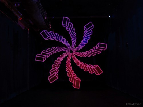
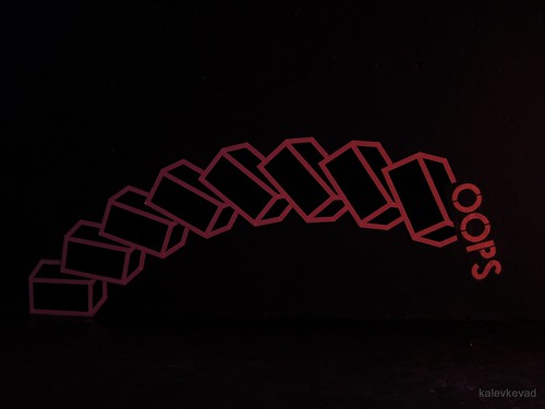
With material as simple as tape and plywood, Aakash Nihalani created a 3D optical illusion in the first beer hall. Like a vortex slowly spinning in your head, or sucking you in, the installation is hanging in the air. The master of tape demonstrated his skills. With your head spinning, you turn around and almost trip over discovering the other installation on the side wall.
HowNosm
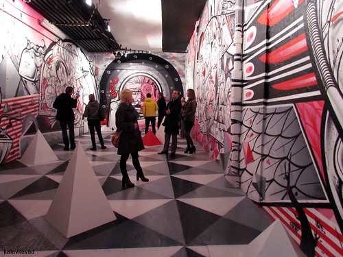
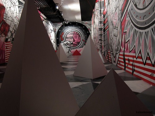
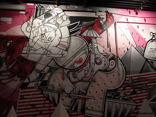
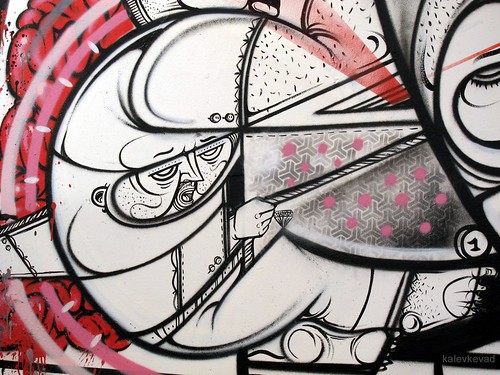
Nobody paint like the HowNosm twins. Their work is pure magic. It seems like the just have a good time painting something here, something there, seemingly in a moderate pace. But if you turn your head away for a moment and then turn back, the work has grown radically. There are an incredible amount of details, both at large and small scale, and both spraycans, paintbrush and stencils are used. Some stencils are repeated, but most of the details are totally unique. Each time I look at their walls I discover more details. I spend far more time discovering their work than they did making it. The style is strictly using only black, white and red. Had it been more colors, we would have needed medication to see it. Or rather, their work is a drug for your mind.
Niels Shoe Meulman
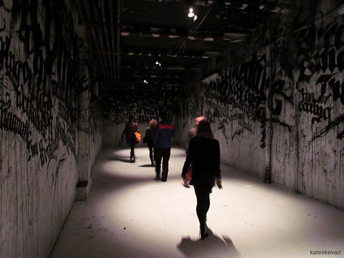
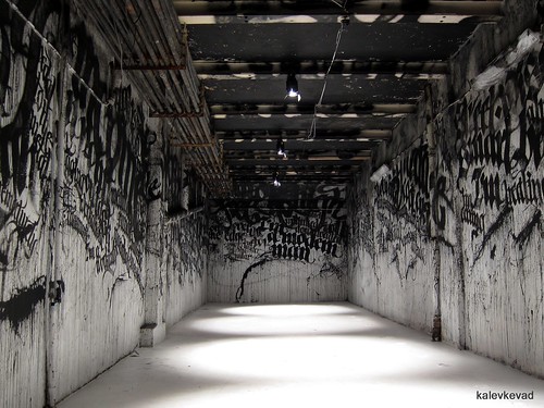
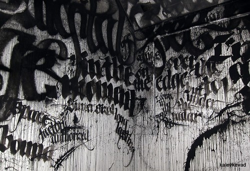
The master of blending graffiti and calligraphy into CALLIGRAFFITI filled the whole tunnel with quites from a comedian. The contrast between the gothic dystopian font and the light message is as striking as the black and white used. The black paint is sprayed onto the walls like the blood of the letters.
Eine & Jordan Seiler
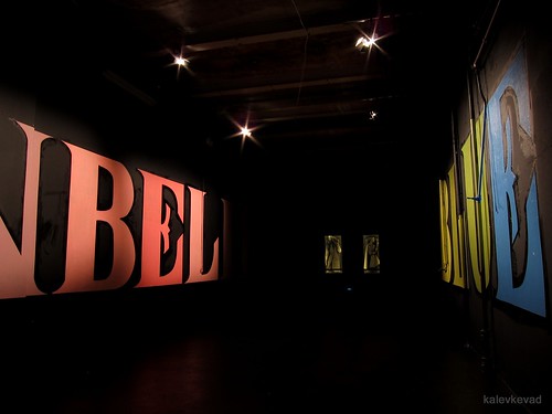
Eine is another artist with the love of letters. The more colorful the better. The text in large colorful letters reads "UNBELIEVEABLY BLUE", revealing that he must have found the E and L of this font especially appealing.
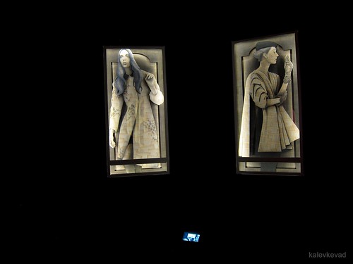
Eine's text is embracing the installation by Jordan Seiler, two lit-up glass boxes with artwork. The installation seems totally out of place with the other street based artworks, and seems rather fit to a traditional gallery space. Until you discover the video displayed, that changes it all. The glass boxes are not made to display art, they are actually advertisement boxes from phone booths in New York. The video shows the artist releasing such a box on the street and walking away with it. What used to display ads are now displaying art.
The portraits are cut and drawed on a collage of pages from respectively the "Pride and Prejudice" and "The King Must Die" novels. Seiler is blending theft, advertisement, fashion, art and litterature in these works.
Sickboy
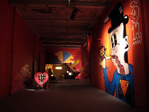
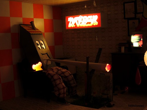
Sickboy created a mad world of a house for a house. A house-shaped person is sitting in his turned-over house, smoking a giant joint, while the tv is on and the model train runs around. There are family portraits on the wall, a walking heart passing by, and somebody has stabbed the house's house to death.
Saber& Ron English
Saber
This
poses the questions: What do we really want? The grey, featureless
walls, the colorful graffiti pieces, or the grey squares? What is the
result of a zero tolerance policy? What is the result of making art a
crime?

Ron English
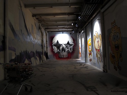
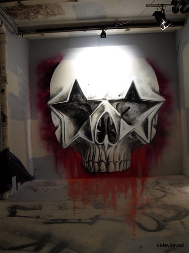
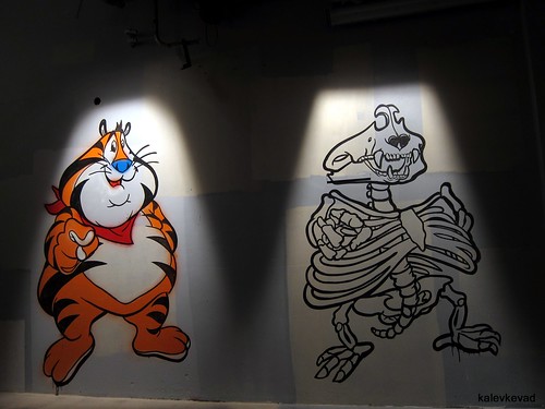
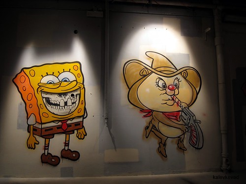
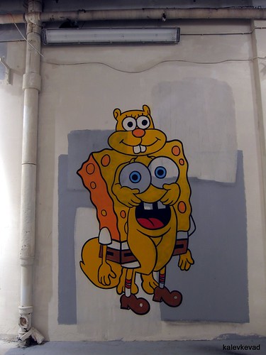
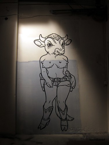
Sharing the room with Saber is another public activist, the legend Ron English. Making fun of advertisement logos and symbols, he brought his sense of humour into the hall of Saber's angry protest. Even the skull, a former symbol of death and horror, lately a symbol of conformity and decor, is turned into a burned out superstar skull candle, with dripping blood seemingly continuing below the floor. The pimped version of Spongebob Squarepants is there, as well as the gene-manipulated cow-girl.
Mobstr
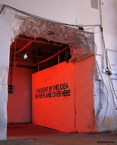
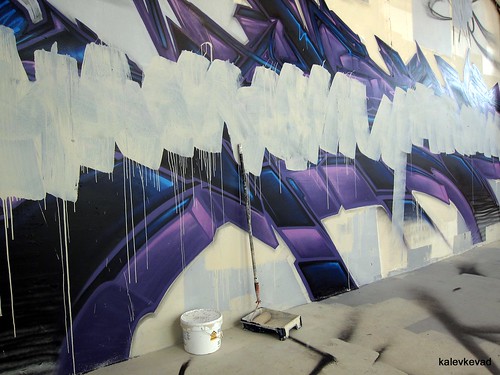
"I thought up this idea on the plane over here" - he probably did, and it works so well. This shows the effect of text even if you have nothing to say. Or maybe he exactly makes a statement by saying nothing.
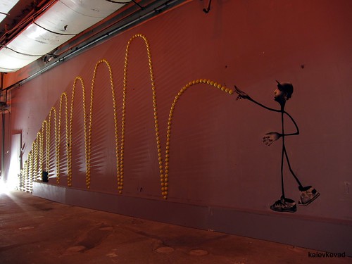
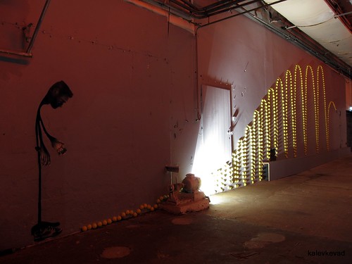
A strange and effective installation/mural of two sticmen throwing a tennisball.
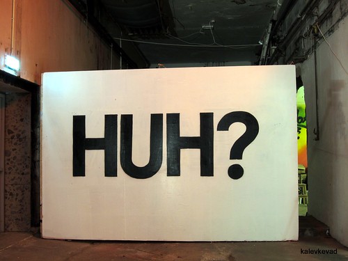
At the end of all the halls, this is Mobstr's conclusion.
Dolk
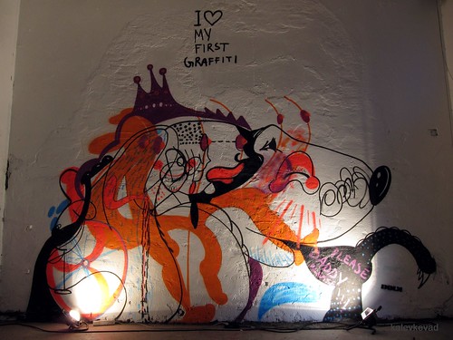
Dolk's indoor work kan be interpreted in many ways. It is up to you to choose which, accept them all, or to make your own. It also makes a difference if this is the first or the last piece you see in the exhibition.
1. It may say that when art is brought away from public space and into the galleries and private spaces, it can be beautiful and great, but not fun anymore. Just consider the difference between Dolk's outside and his inside work.
2. Art should surprise you. It surprises you when you suddenly discover a new piece, not when you go to an expected opening of an exhibition. Especially if you there get served exactly what you expect the artist to make.
3. What are the consequences of Zero Tolerance on graffiti? One outcome is bad art due to fewer possibilities for the artists to develop their skills. Instead of goodlooking art, we will have more "ugly" or immature art. Dolk writes "I love my first graffiti", but like most other artists, he is probably the only one that likes his first piece. Artists need an environment where they can develop their talent.
4. Dolk maybe got bored, and wanted to have fun. We all expect Dolk to make these smart, funny stencil pieces. With this piece he makes us laugh by surprise.
